SiteBase2 Lessons
This page contains a step-by-step lessons to manually recode SiteBase2 from scratch, by hand, as a way to learn the basics of front-end development.
SiteBase2 Lessons
SiteBase2 is a static HTML + CSS + JS front-end base (starter/boilerplate). The lessons below are for those interested in coding a basic front-end framework for a simple static site from scratch by hand, line-by-line. No prior web design or coding experience required. Designed for first-time front-end coders, SiteBase2 uses no pre-processing (e.g. SASS), no command line interface (CLI), and no special software. All you need is a text editor and a browser.
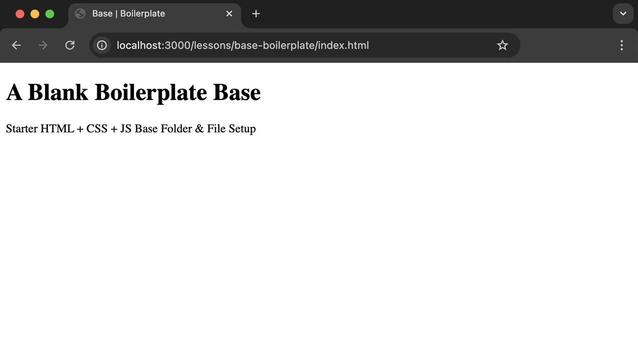
Step 1 Static Site Boilerplate
Description:
Set up your local development environment by creating a basic folder structure and file system containing only the core essential boilerplate code required for a bare-bones, no content starter setup suitable for any simple static site project.
- Create a "base-boilerplate" root folder
- Create "css" and "js" sub folders
-
Add an index.html file
- Add boilerplate markup
-
Link to a style.css file
- Add sample css table of contents
- Link to a script.js file
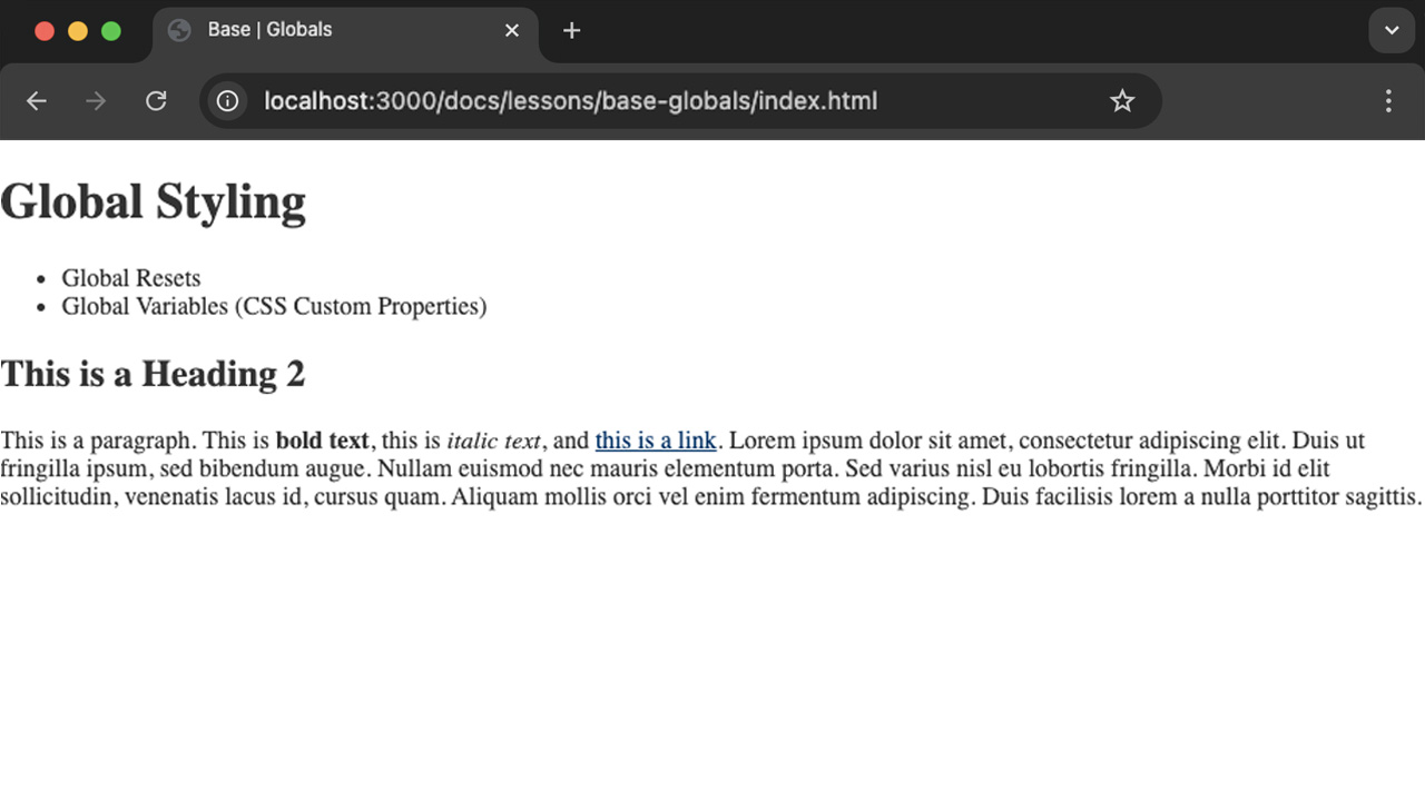
Step 2 Base Globals
Description:
A general best-practice is to set any global-level (site-wide) styling at the top of your style.css document. This approach allows for the writing of DRY ("Don't Repeat Yourself") code and takes advantage of helpful CSS features such as inheritance via the cascade (The "C" is "CSS"). Examples of global settings include site-wide resets (e.g. the removal of body margins and setting the box-sizing defaults for all elements), css custom properties (defining any reusable site-wide variables such as commonly used colors, fonts, and spacing units), and any high-level/site-wide styles for commonly used elements, such as the body background and text colors, link colors, and font settings for headings that will be commonly re-used across the site.
- Duplicate your "base-boilerplate" folder and rename it to "base-globals"
- Delete your "js" folder and link to it (we will add it back later)
- OPTIONAL: Delete your meta description and keywords from your html head for now. YOu should add these back in for client work production sites.
-
Add some temporary initial starter content to your index.html file that will allow you to see the
impact of your global styles to your style.css file:
-
Temporary starter content:
- A paragraph containing commonly used inline text markup, such as links, bold text, and italic text.
- Global Styles to include
- Global variables: define a basic starter set of commonly used custom properties that you will likley need, such as site-wide colors and fonts.
- Global resets: remove the default body margins and set the box-sizing defaults for all elements to border-box.
- Global colors: set the colors for common elements such as the body background color, text color, and link colors.
-
Temporary starter content:
Step 3 Base Content
Description:
If "Content is King" then Typography is the Queen, so a good way to start designing
coding content is to set your type. Define your base-level typographic style settings and associated
rules (e.g. your default body font size and leading, heading sizes using a typographic scale, etc).
Next, define base-level styles for commonly used content, such as images (e.g. responsive
images), along with core essential UI components (e.g. buttons) .
- Duplicate your "base-globals" folder and rename it to "base-content"
-
Add more starter/base content markup to your index.html file and accompanying base
content styles to your style.css file:
-
Base Typography
- Add all headings h1-h6 and manually set the default typographic scale.
- Add two sets of lists: unordered and ordered (no styling needed).
-
Base Media (Responsive)
- Add an inline image with global styling for all images to be responsive by default.
-
Base Components
- Buttons (it is optional to add an alternate style/version).
-
Base Typography
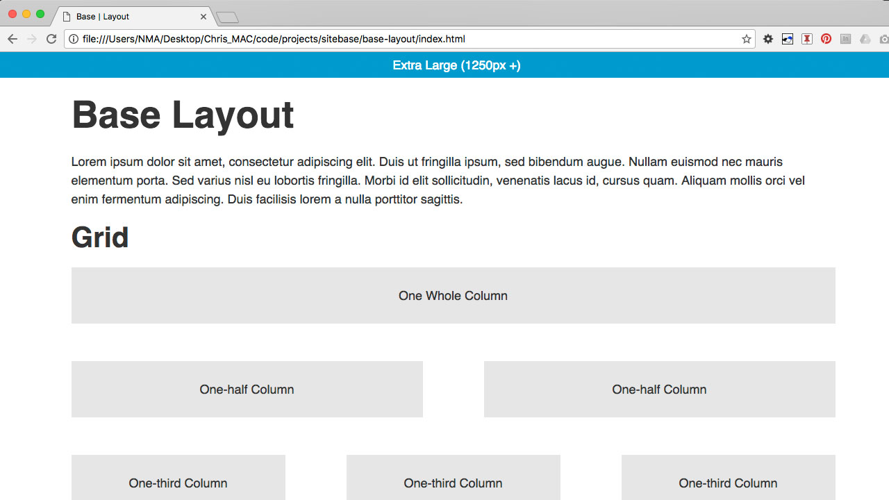
Step 4 Base Layout
Description:
Make your base responsive by setting up media queries targeting different screen sizes and use a simple grid for the layout of your content.
- Duplicate your "base-content" folder and rename it to "base-layout"
- Remove all content from index.html and add "demo" grid markup
-
Add a basic set of media queries and a simple grid to your style.css file
- Media Queries (with body font-size settings and a "container" with a fixed width for large screens and fluid for small screens)
- Custom Grid (multiple columns for large screens, stacked columns for small screens)
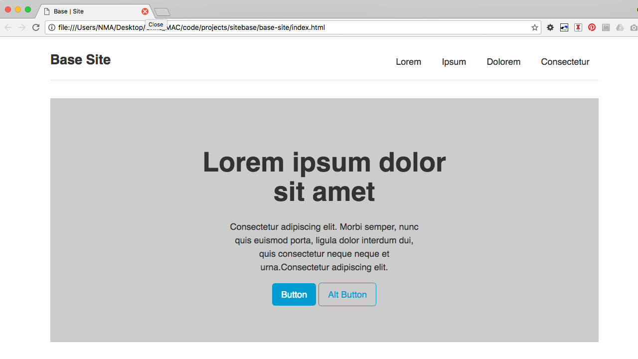
Step 5 Base Site Structure (Home Page)
Description:
Use semantic HTML5 elements to set up a common site structure including a site header, footer, navigation, and main content area.
- Duplicate your "base-layout" folder and rename it to "base-structure"
-
Remove all content from index.html and add base structural
site markup:
- Header, Footer, Navigation, Main Content Areas (e.g. Hero Section, 3-Column placeholder content)
-
Add base structural site styling your style.css file
-
Base Site Structure
- Header, Logo, Footer, Sections
-
Base Navigation
- Header Nav, Footer Nav
-
Base Site Structure
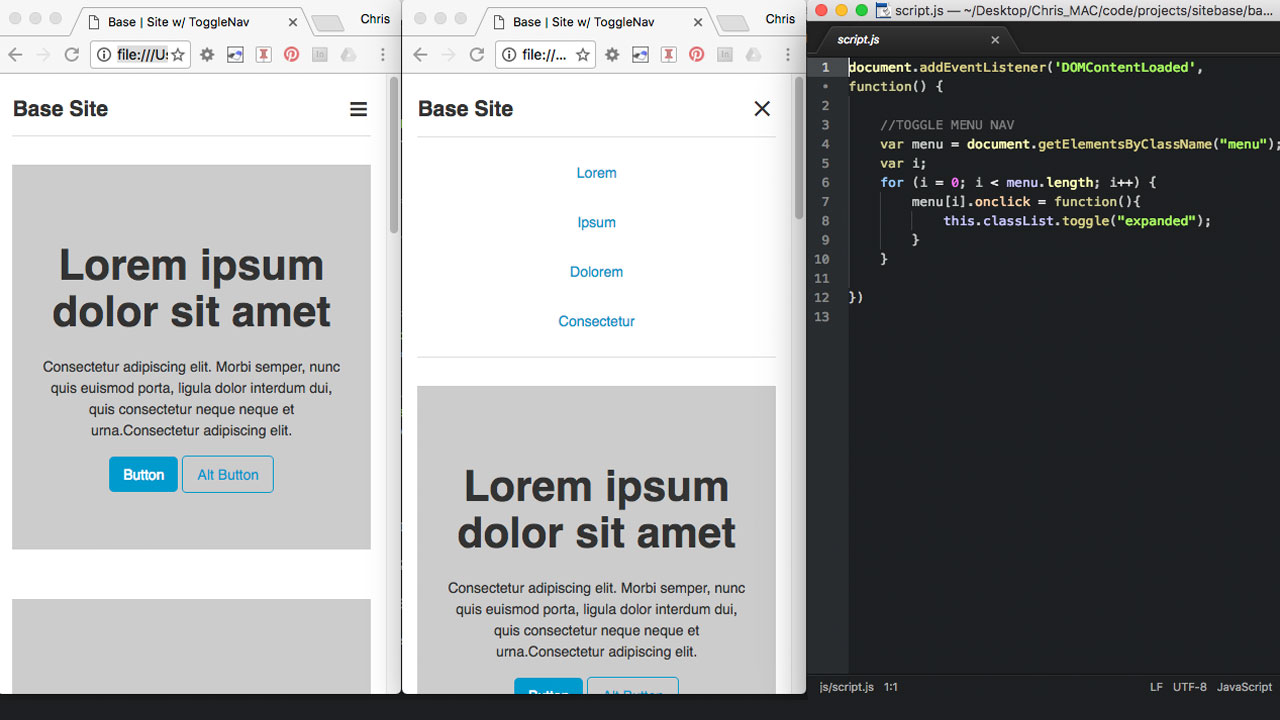
Step 6 Mobile Menu (Toggle Nav)
Description:
Use Javascript to make a a simple toggle-style main navigation for small screen sizes.
- Duplicate your "base-structure" folder and rename it to "base-togglenav"
- Add back a "js" folder and script.js file
- Add a "menu" element to your main navigation.
- Add a custom JavaScript function that will change the value of a custom data-attribute from "open" to "closed" to open and close the main navigation on smaller screens.
- Style the menu to look like a three-bar navicon.
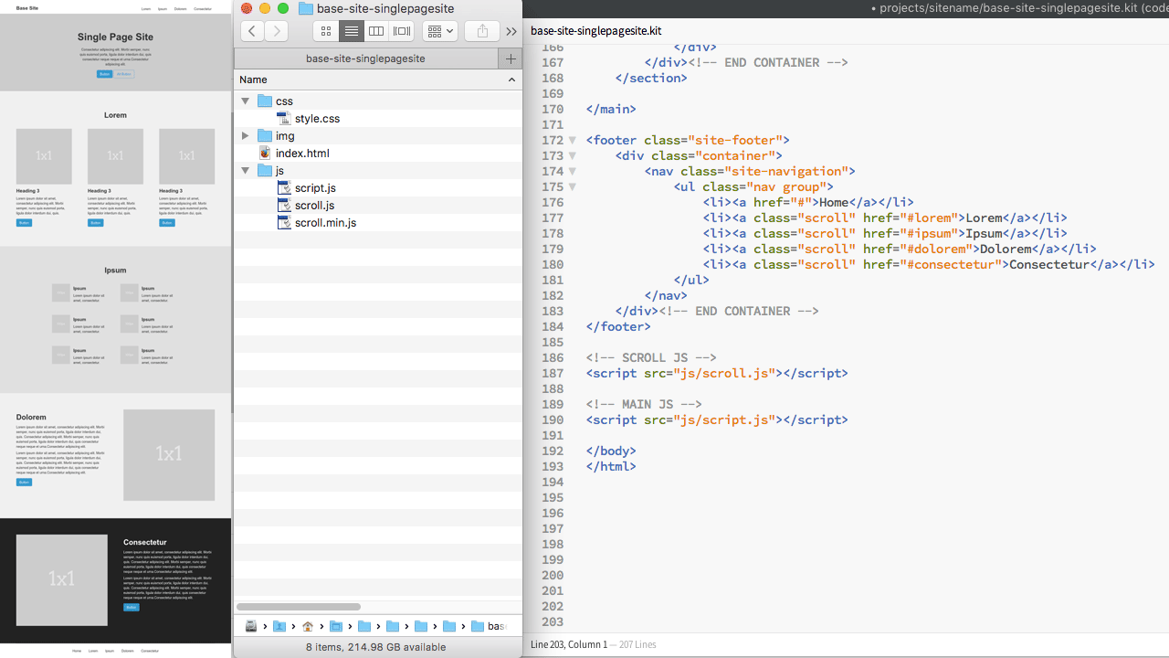
Step 7 Single Page Site w/ Sub Sections
Description:
Create a single page web site with multiple sub sections that can be accessed via the inline page anchors in the site navigation or by scrolling the long, vertical layout of the page.
- Duplicate your "base-togglenav" folder and rename it to "base-singlepagesite"
- Working with one main index.html file, update the site navigation to link to page anchors (ID's) for each of the main sub sections (e.g. a href="#section1" or href="#about")
- Add sub sections with ID's and headings for each major sub sections (e.g. section id="section1" or id="about")
- Create sub sections that are commonly found and well suited for single page websites, such as a short about section, a brief overview of services section, and a brief contact section with basic contact information.
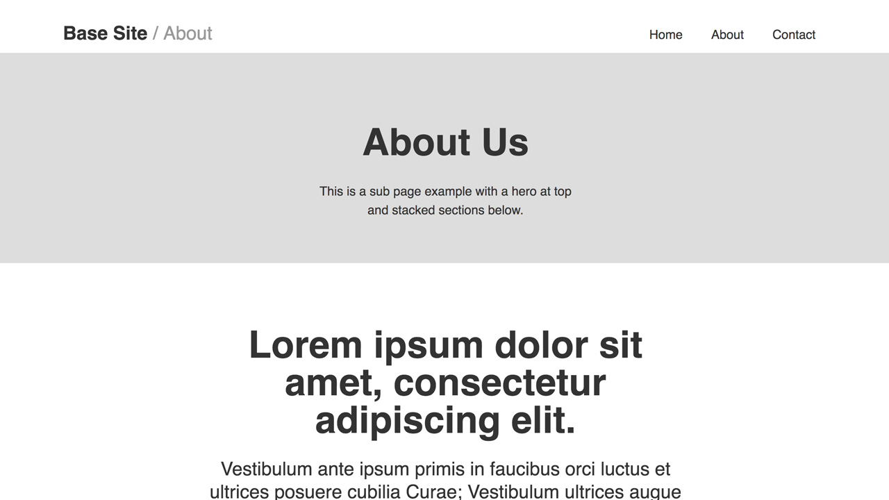
Step 8 Multiple Page Site w/ Sub Pages
Description:
Create sub pages that are commonly used and well suited for specific content, such as a standalone about page, a services or products listing page, and a contact page with a cust contact form. Other sub pages to consider would be article pages or blog posts with longer form content, or a traditional two-column sub page with a main content area and sidebar with a sub nav.
- Duplicate your "base-singlepagesite" folder and rename it to "base-multiplepagesite"
-
Update the index.html page site navigation to link to the
following example sub pages;
- about.html, contact.html (optional: products.html, product-detail.html)
- Duplicate the index.html page and to create each of the above example sub pages
-
Potential new features/components to consider when adding
sub pages and sub page content:
- Custom hero sections for each page, custom forms with custom styling, common content layouts such as responsive grids for lists and thumbnail images, and other popular design patterns and UI components such as module tabs, overlays/modlas, carousels, and accordians/collapsible panels.
Step 9 Custom Site
Override the base styling with site-specific styling and custom HTML, CSS, & JS.
- Add a section entitled "SITE SPECIFIC CSS" to the bottom of your base style.css file and use this area to add any custom site-specific (e.g. project-specific, client-specific, etc) styling. Try not to edit your "BASE CSS" above. Instead, try to override the base styles at the bottom of your style sheet in this designated area that is seperate from your base styles.
-
Style (CSS) changes to consider:
- Customize the typography.
- Use a custom color palette
- Consider adding aesthetic graphical elements such as line, shape, texture, and background photography.
-
Content (HTML) changes to consider:
- Change the header and brand identity of the site (e.g. change the site name, add a logo, add a tagline, etc.).
- Use real content (no placeholder photos or copy).
- Consider using a "content-first" approach to establish a strong content hierarchy, information architecture (IA), and navigation.
- Use your grid (rows and columns) to experiment with different layouts to best present the content.
- Utilize and embrace known good usability practices, UX design patterns, and UI components.