SiteBase Docs
An overview of framework features including core HTML elements and default CSS settings.
Get Started
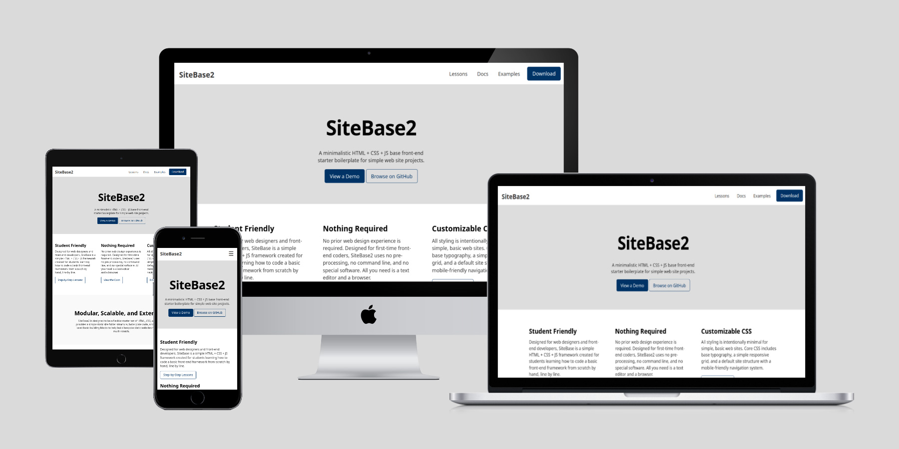
SiteBase2 was designed to be used two different ways:
- As a blank starter project - to be downloaded as a starter set of boilerplate code that developers can then "save as" and modified as quick-and-easy way to custom build a bespoke static website.
- As a learning project - to be manually recoded from scratch by following a set of step-by-step lessons designed specifically for beginner level web designers and frontend web developers looking to learn how to manually code bespoke static sites from scratch.
Download SiteBase2 .zip File
The easiest way to jump right in and get started is to download SiteBase2 as a blank starter set of files and folders that are already set up to be customized to begin manually coding any bespoke static website project. No build tool required. Just download the project folder, rename it, and customize it. It's that simple.
Follow the Step-by-Step Lessons
The harder (but more meaningful) way to begin using SiteBase2, is to manually recode it from scratch by following along with step-by-step lessons with detailed instructions to create your own site base. SiteBase2 was designed for UX/UI designers and beginner-level frontend web development students. It is 100% open source and free to use for any and all projects inclusing personal and commercial websites.
Folder Structure
base/
├── index.html
├── css/
│   ├── style.css
└── js/
    ├── scripts.js
Boilerplate Template
HTML
Mobile ready with links to external CSS and JS files.
CSS
CSS Table of Contents:
JS
Vanilla Javascript inside of one script.js file.
Global Styles
Global CSS Resets
Basic CSS reset to remove default browser styling (e.g. default body margins) and enable helpful features such as smooth-scrolling.
/* CHANGE BOX-SIZING FOR ALL TO BORDER-BOX */
* { box-sizing: border-box; }

/* REMOVE THE DEFAULT 8px MARGIN ON THE BODY */
body { margin: 0; }

/* ENABLE NATIVE SMOOTH SCROLLING */
html { scroll-behavior: smooth; }
Global Colors
SiteBase comes with a starter set of global colors defined in CSS custom properties (variables).
- #fff Body BG
- #333 Text
- #000 Headings
- #036 Links
- #003 Link Hovers
- #ddd Hero BG
Global CSS Custom Properties (Variables)
CSS custom properties (variables) for global (site-level) colors and fonts.
:root {

  /* BASE COLORS */
  --color-body-background: #fff;
  --color-text-body: rgb(0 0 0 / 0.8);
  --color-text-headings: rgb(0 0 0 / 1);
  --color-links: #036;
  --color-links-hover: #003;

  /* BASE TYPOGRAPHY */
  --font-body: system-ui, Helvetica, Arial, sans-serif;
  --font-headings: system-ui, Helvetica, Arial, sans-serif;

}Typography
Default Heading Styles
SiteBase comes with default styling settings that help to support best practices for good typography specifically for headings.
/* # GLOBAL HEADING SETTINGS */
h1, h2, h3, h4, h5, h6 {

  /* SET THE DEFAUT FONT FAMILY FOR ALL HEADINGS */
  font-family: var(--font-headings);

  /* SET THE COLOR OF ALL HEADINGS */
  color: var(--color-text-headings);

  /* SET THE DEFAUT MARGINS ALL HEADINGS */
  margin: 1em 0 0.5em 0;

  /* BALANCE ALL MULTI-LINE HEADINGS */
  text-wrap: balance;

}
This is a Heading 1
This is a Heading 2
This is a Heading 3
This is a Heading 4
This is a Heading 5
This is a Heading 6
<h1>This is a Heading 1</h1>
<h2>This is a Heading 2</h2>
<h3>This is a Heading 3</h3>
<h4>This is a Heading 4</h4>
<h5>This is a Heading 5</h5>
<h6>This is a Heading 6</h6>
Lorem ipsum dolor sit amet, consectetur adipiscing elit. Duis ut fringilla ipsum, sed bibendum augue. Nullam euismod nec mauris elementum porta. Sed varius nisl eu lobortis fringilla. Morbi id elit sollicitudin, venenatis lacus id, cursus quam. Aliquam mollis orci vel enim fermentum adipiscing. Duis facilisis lorem a nulla porttitor sagittis.
Suspendisse pulvinar bibendum laoreet. Suspendisse eget dignissim risus. Cras eget sodales enim. Phasellus accumsan dui metus, quis vulputate turpis congue at. Praesent rutrum consequat rhoncus. Maecenas adipiscing justo vitae massa porta pretium. In egestas orci vehicula, tempus lorem ut, facilisis metus.
Default Paragraph Syles
SiteBase comes with default text styling that embraces best practices for good typography specifically
for body text and paragraphs, such as limiting the number of characters per line for readability
(horizontal measure) and modern browser support for text-wrap: pretty to avoid widows.
p {

  /* SET THE DEFAUT MARGINS ALL PARAGRAPHS */
  margin: 0.5em 0;

  /* SET THE NUMBER OF CHARACTERS PER LINE */
  max-width: 65ch;

  /* WIDOW FIXER */
  text-wrap: pretty;

}
Vivamus eu mollis velit. Maecenas id massa libero. Aliquam accumsan mauris vulputate purus volutpat vestibulum. Phasellus sed tellus id tortor ornare molestie. Quisque massa sapien, elementum sed tortor vitae, suscipit congue massa. Curabitur tempor arcu eget leo placerat, a porta augue pharetra. Nulla velit nibh, laoreet at hendrerit sit amet, adipiscing eget dolor.
<p>Lorem ipsum dolor sit amet, consectetur adipiscing elit.
Duis ut fringilla ipsum, sed bibendum augue.</p>
Lists with Native User Agent Styles
SiteBase does not override the default user agent styles for lists.
Unordered Lists:
- List Item
- List Item
-
Nested Unordered List:
- List Item
- List Item
-
Nested Ordered List:
- List Item
- List Item
- List Item
- List Item
<ul>
    <li>List Item<li/>
    <li>List Item<li/>
</ul>
Ordered Lists:
- List Item
- List Item
-
Nested Unordered List:
- List Item
- List Item
-
Nested Ordered List:
- List Item
- List Item
- List Item
- List Item
<ol>
    <li>List Item<li/>
    <li>List Item<li/>
</ol>
Links:
This is a link.
<a href="#">link</a>
Helpers:
This is center-aligned text
<p class="text-centered">This is center-aligned text</p>
Media
Default support for responsive images and videos.
img, video {
    max-width: 100%;
    height: auto;
}
This is a responsive inline image:

<img src="path/to/image.jpg" alt="placeholder" width="1200" height="400">
This is a responsive inline video:
<video controls>
  <source src="videos/placeholder-video.mp4" type="video/mp4">
  Your browser does not support the video tag.
</video>
UI Components
Buttons:
Default Link Button Alt Link Button<a href="#" class="button">Default Link Button</a>
<a href="#" class="button alt">Alt Link Button</a>
<button>Default Button Element</button>
Media Queries
Mobile-first media queries with four target screen sizes:
- Small (Mobile): 0-767px+ (default)
- Medium (Tablet): min-width: 768px+
- Large (Notebook): min-width: 1050px+
- ExtraLarge (Desktop): min-width: 1250px+
// MOBILE FIRST DEFAULT FOR SMALL/MOBILE SCREENS

// MEDIUM/TABLET SCREENS
@media (min-width:  768px) { .. }

// LARGE/NOTEBOOK SCREENS
@media (min-width: 1050px) { .. }

// FOR EXTRA-LARGE/DESKTOP+ SCREENS
@media (min-width: 1250px) { .. }
Container
Reusable container div that is fluid width (percentage based) on small screens and fixed width on large screens.
<div class="container"></div>
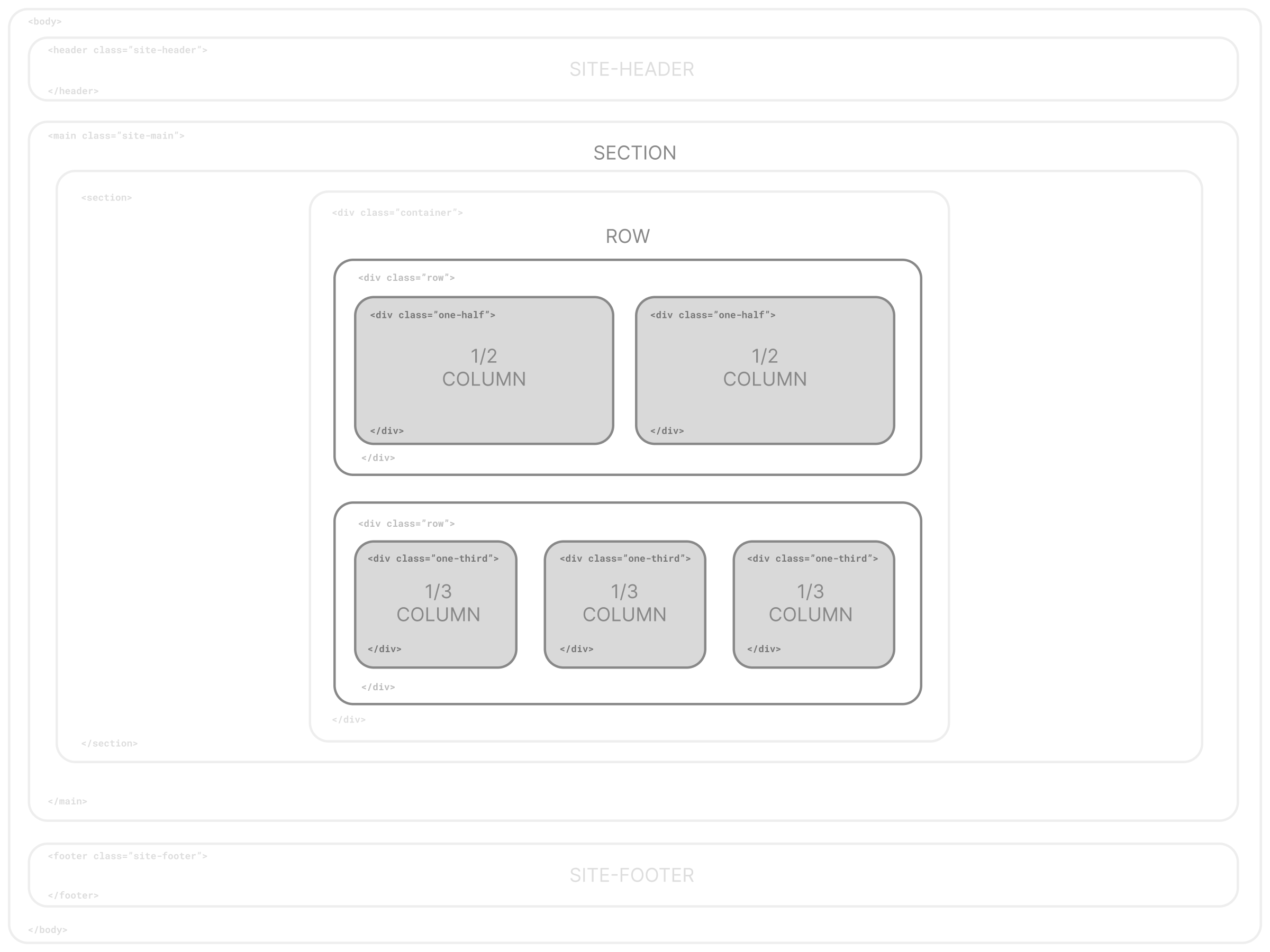
A Simple Semantic Grid System
By default, SiteBase comes with a simple semantic grid system based on stacked rows
(<div class="row">) with nested columns and a default set of commonly used,
easy-to-remember semantic class names such as class="one-half" or
class="one-third".
One Whole Column
One-half Column
One-half Column
One-third Column
One-third Column
One-third Column
One-third Column
Two-thirds Column
One-fourth Column
One-fourth Column
One-fourth Column
One-fourth Column
<div class="row">
    <div class="one-half column">
        <p>One-half Column</p>
    </div>
    <div class="one-half column">
        <p>One-half Column</p>
    </div>
</div>
One-half Column Centered
<div class="row">
    <div class="one-half column centered">
        <p>One-half Column Centered</p>
    </div>
</div>
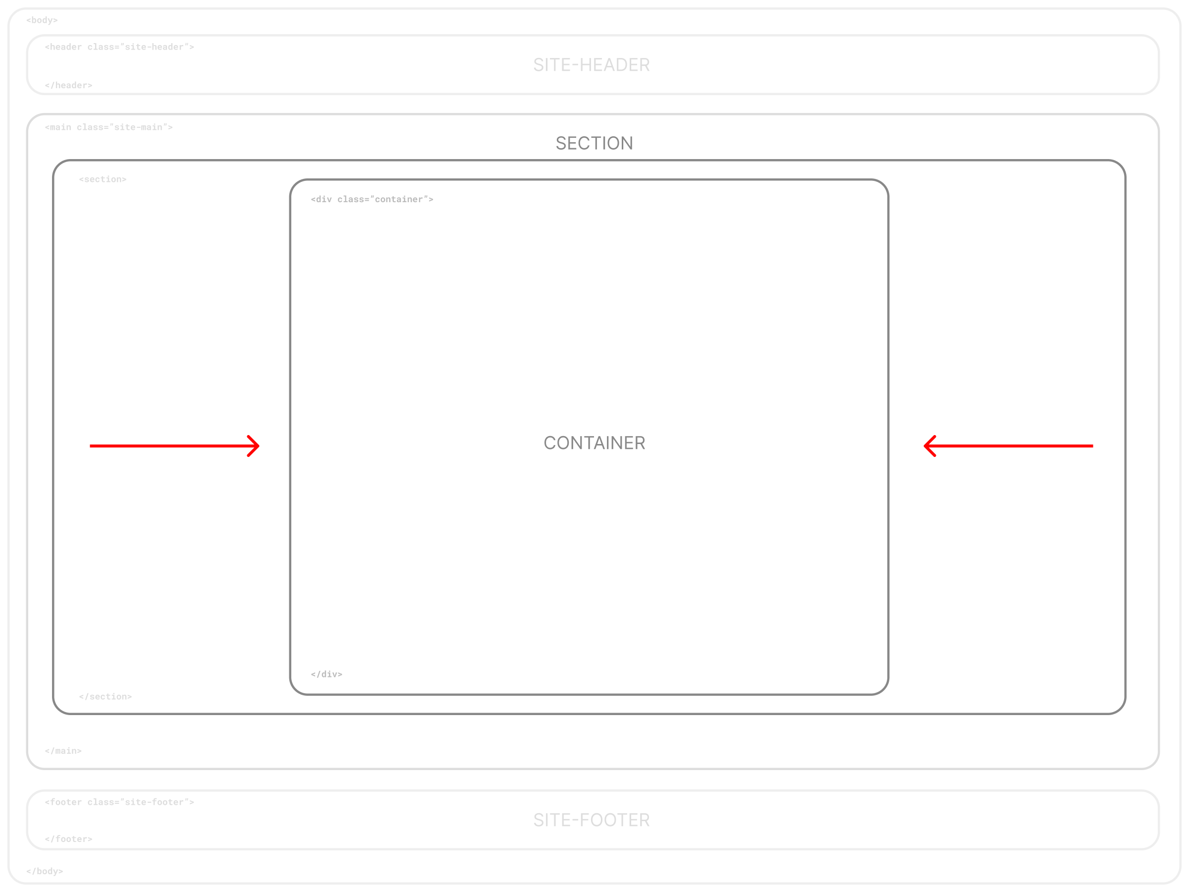
Page Structure
Header, Main Content Area, & Footer
The base site structure consists of three main parts in the body section of the web page: the header, main, and footer. Many websites are structured this way, with each stacked one on top another vertically and rendering via normal flow (top to bottom) in the browser.
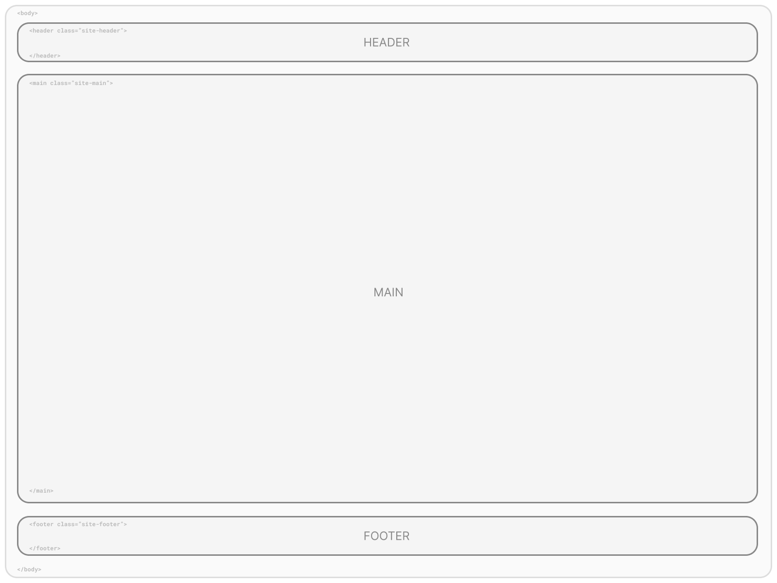
<body>

    <header class="site-header">
    </header>

    <main class="site-main">
    </main>

    <footer class="site-footer">
    </footer>

</body>
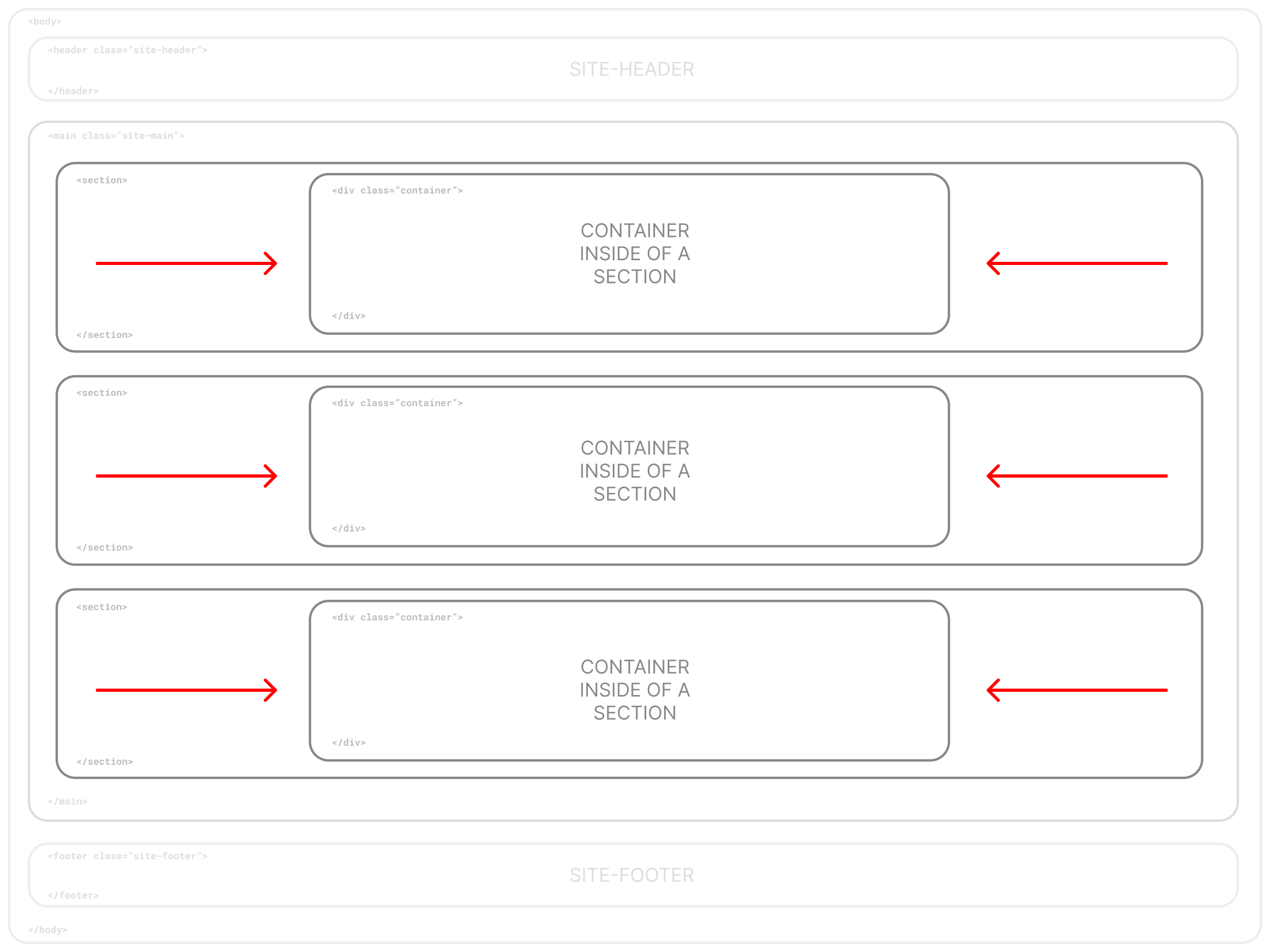
One Main Content Area with Multiple Stacked Sections
By default, each page has one <main> element for all main content to reside with no
default styling (e.g. no margins or padding) to allow multiple <section> elements to
be nested inside and stacked on top of one another
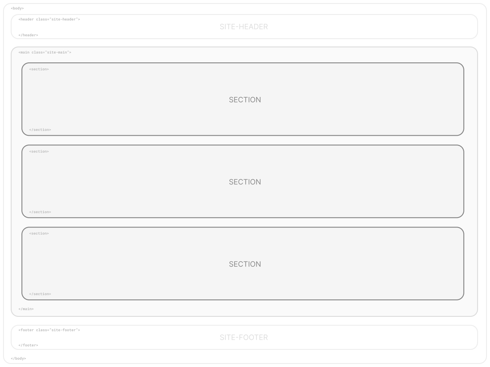
Each <section> is full-width by default, extending to the full-width of the browser.
To constrain content width, sections can either be nested within a parent
<div class="container"></div> element, or each section can have nested <div class="container"></div>
elements inside of each (recommended). This base also includes default styling for a "hero" section.
<main class="site-main">

    <section class="hero">
        <div class="container">
            HERO SECTION CONTENT
        </div>
    </section>

    <section>
        <div class="container">
          SECTION CONTENT IN A CONTAINER
        </div>
    </section>

    <section>
        SECTION CONTENT NOT IN A CONTAINER
    </section>

</main>
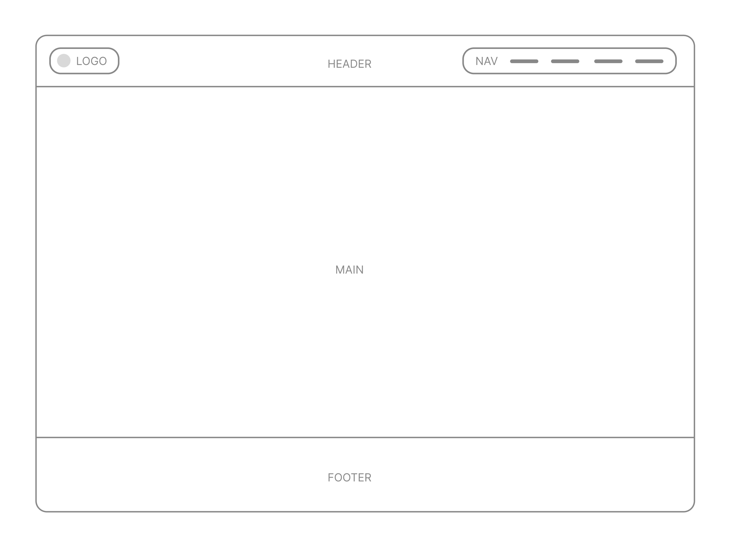
Site Navigation
This base consists of a primary navigation area on the top of each page with the site header. By default it renders the logo on the left and navigation on the right, but can be easily customized.
<nav class="site-navigation">
    <ul>
        <li><a href="#">Nav Item</a></li>
        <li><a href="#">Nav Item</a></li>
        <li><a href="#">Nav Item</a></li>
    </ul>
</nav>
Responsive Mobile Menu Option
For small screens, this base comes with a toggle-nav option with a three-bar navicon as a menu button. Javascript is used to toggle the menu on/off by changing the value of a data-attribute. CSS is then used to control the appearance of the menu.
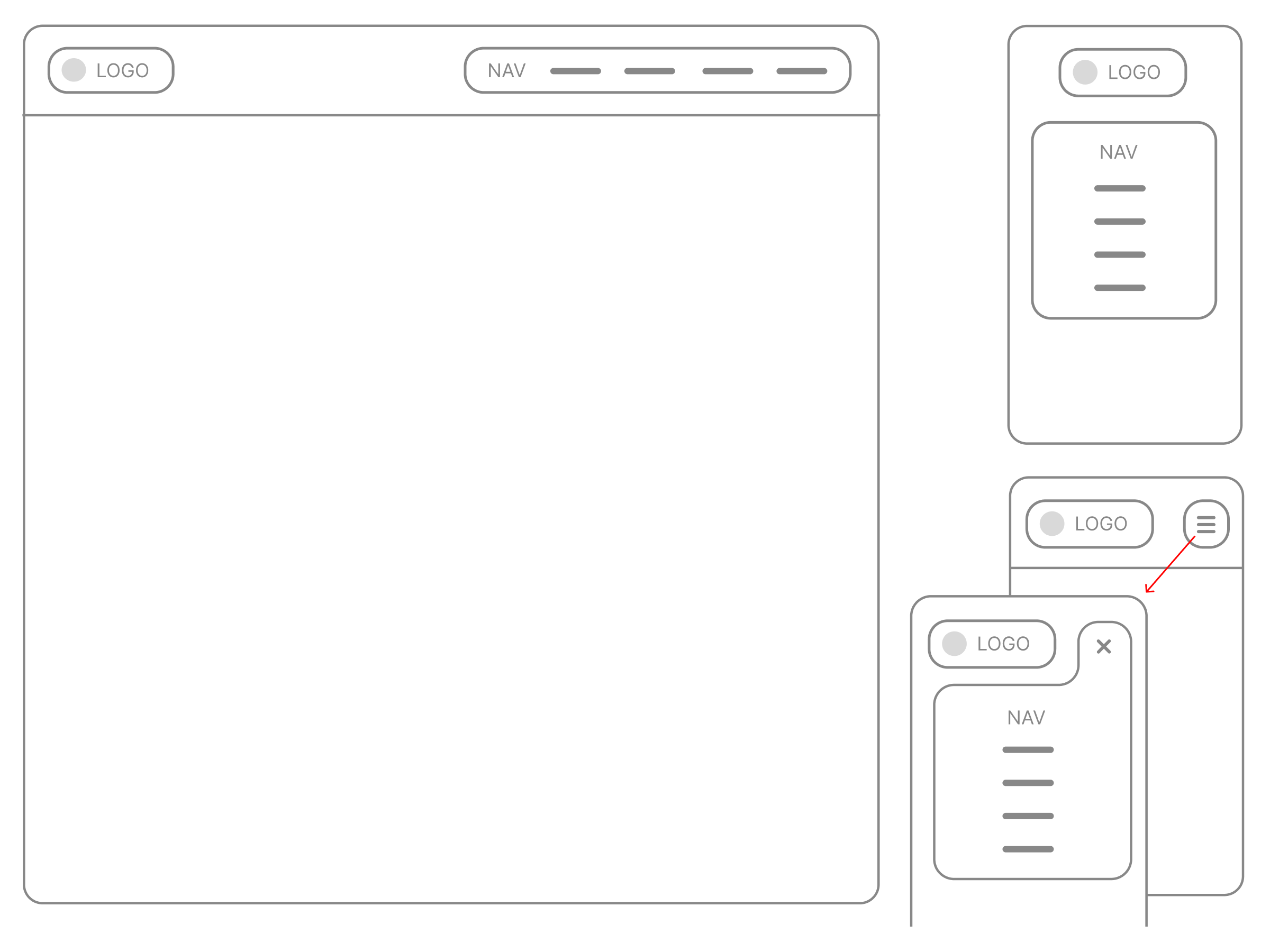
Mobile menu HTML:
<nav class="site-navigation">
    <button class="menu-button navicon">Menu</button>
    <ul class="nav">
        <li><a href="#">Nav Item</a></li>
        <li><a href="#">Nav Item</a></li>
        <li><a href="#">Nav Item</a></li>
    </ul>
</nav>
Mobile menu Javascript:
  //TOGGLE MENU NAV VIA ADDING/REMOVING A DATA-ATTRIBUTE
  const menubutton = document.querySelector('.menu-button');
  const menunav = document.querySelector('.toggle-nav');
  menubutton.addEventListener('click', function() {
    if (menunav.getAttribute('data-navstate') === 'open') {
        menunav.setAttribute('data-navstate', 'closed');
    } else {
        menunav.setAttribute('data-navstate', 'open');
    }
  });