SiteBase Lessons
Step-by-step guides to learn the basics of front-end development by manually hand-coding a simple boilerplate framework.
SiteBase 1.0 Lessons
SiteBase 1.0 is a static HTML + CSS + JS front-end base (starter/boilerplate). The lessons below are for those interested in coding a basic front-end framework for a simple static site from scratch by hand, line-by-line. No prior web design or coding experience required. Designed for first-time front-end coders, Site Base 1.0 uses no pre-processing (e.g. SASS), no command line interface (CLI), and no special software. All you need is a text editor and a browser.
Watch an Intro VideoStep 1 Base Blank
Description:
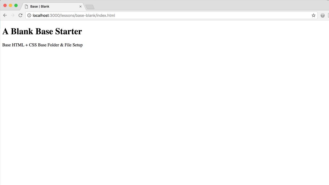
Set up your local development environment by creating a basic folder structure and file system containing only the core essential code required for a bare-bones, no content starter setup suitable for any project.
- Create a "base-blank" root folder
- Create "css" and "js" sub folders
-
Add an index.html file
- Add starter markup
-
Link to a style.css file
- Add starter css table of contents
- Link to a script.js file
Screenshot:
Note: You might notice some differences between the markup shown within the video lesson and the markup provided within the source code. These are changes that have been made in the years safter the video lesson was recorded.
Some notable updates/changes:
- For self-closing elements (e.g. meta tags), you no longer need to have an empty space and a closing forward slash. This is a relatively new recommendation.
Step 2 Base Content
Description:
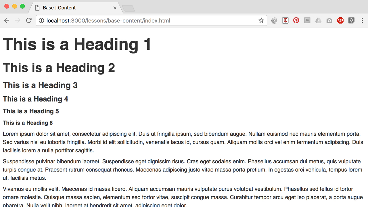
If "Content is King" then Typography is the Queen, so a good way to start designing
coding content is to set your type. Define your base-level typographic style settings and associated
rules (e.g. your default body font size and leading, heading sizes using a typographic scale, etc).
Next, define base-level styles for commonly used content, such as images (e.g. responsive
images), along with core essential UI components (e.g. buttons) .
- Duplicate your "base-blank" folder and rename it to "base-content"
- Delete your "js" folder and link to it (we will add it back later)
-
Add base content markup to your index.html file and base
content styles to your style.css file:
-
Base Typography
-
Body, Headings, Paragraphs, Links,
Lists, Blockquotes, & Helpers
-
Body, Headings, Paragraphs, Links,
-
Base Media
- Images
-
Base Components
- Buttons
-
Base Typography
Note: You might notice some additional css that may not be represented within the markup or addressed within the video lesson, such as horizontal rules (hr) and various helper classes. These exist within the SiteBase core and while they may not required for all projects, they are included here as an example for how one could choose to extend and customize SiteBase.
Note: You might also notice some differences between the markup shown within the video lesson and the markup provided within the source code. These are changes that have been made in the years safter the video lesson was recorded.
Some notable content-related updates/changes:
- For all inline images (img tags) it is now recommended that you also include width="" and height="" attributes. This helps to eliminate Cumulative Layout Shift (CLS).
Step 3 Base Layout
Description:
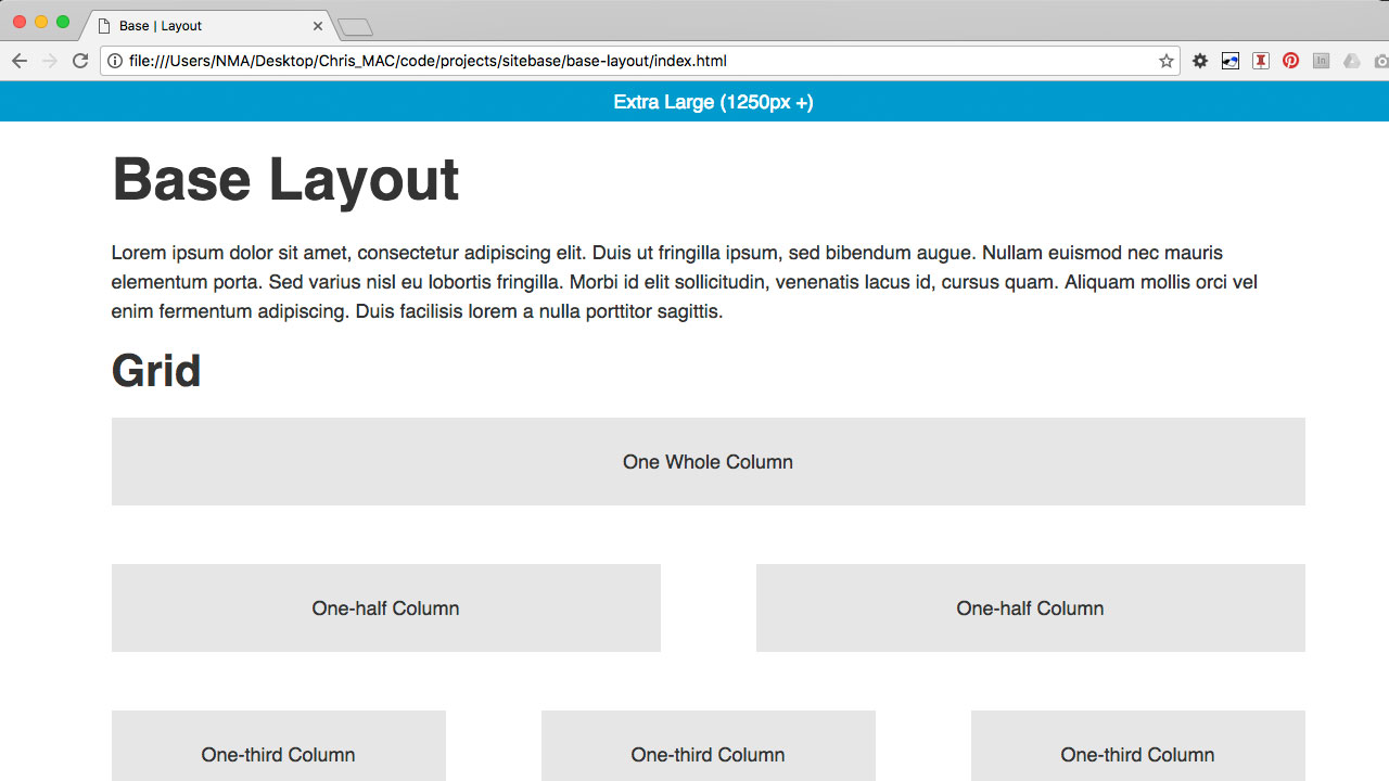
Make your base responsive by setting up media queries targeting different screen sizes and use a simple grid for the layout of your content.
- Duplicate your "base-content" folder and rename it to "base-layout"
- Remove all content from index.html and add "demo" grid markup
-
Add a simple reset, media queries, and a simple grid to your style.css file
- Simple Reset (set all elements to box-sizing: border-box and remove your default body margins)
- Media Queries (with body font-size settings and a "container" with a fixed width for large screens and fluid for small screens)
- Custom Grid (multiple columns for large screens, stacked columns for small screens)
Step 4 Base Site Structure (Home Page)
Description:
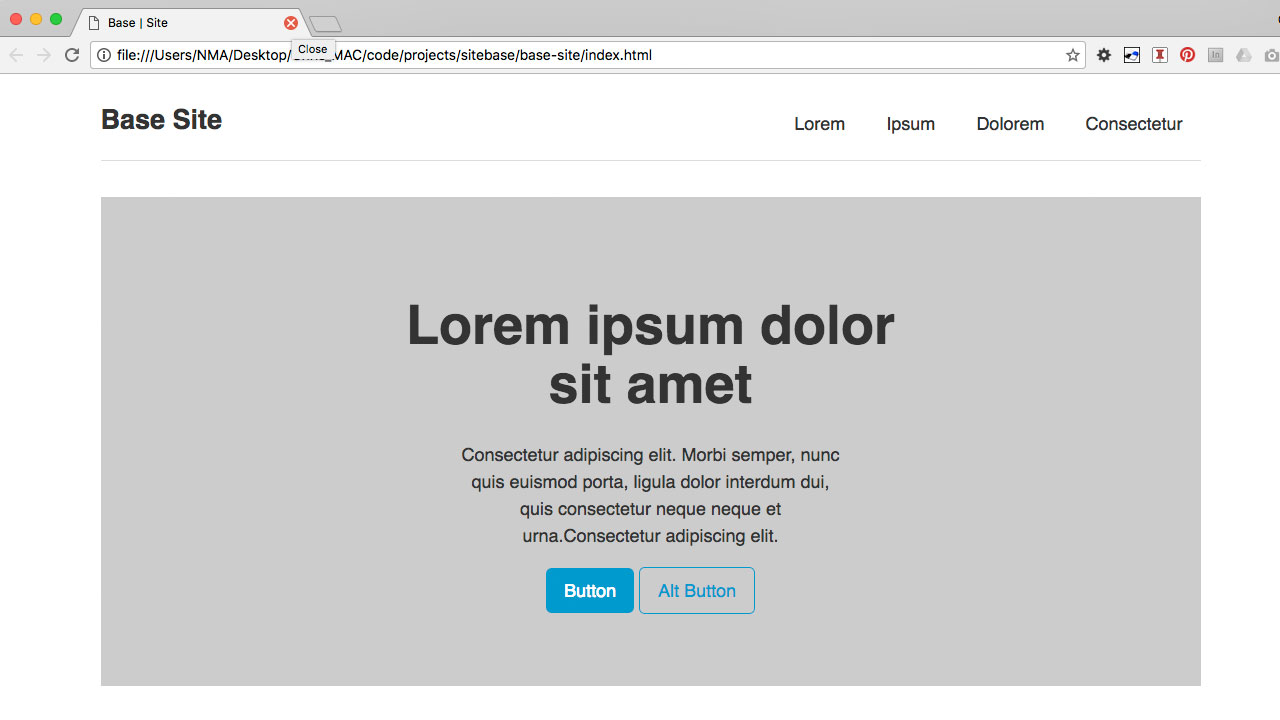
Use semantic HTML5 elements to set up a common site structure including a site header, footer, navigation, and main content area.
- Duplicate your "base-layout" folder and rename it to "base-site"
-
Remove all content from index.html and add base structural
site markup:
- Header, Footer, Navigation, Main Content Areas (e.g. Hero Section, 3-Column placeholder content)
-
Add base structural site styling your style.css file
-
Base Site Structure
- Header, Logo, Footer, Sections
-
Base Navigation
- Header Nav, Footer Nav
-
Base Site Structure
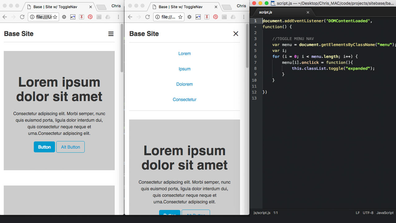
Step 5 Mobile Menu (Toggle Nav)
Description:
Use Javascript to make a a simple toggle-style main navigation for small screen sizes.
- Add back a "js" folder and script.js file
- Add a "menu" element to your main navigation.
- Add a custom JavaScript function that will change the value of a custom data-attribute from "open" to "closed" to open and close the main navigation on smaller screens.
- Style the menu to look like a three-bar navicon.
UPDATE: In 2022, the markup for the menu-button was updated from a div to a button element. To implement this, a few new lines of css were added to .menu-button: a reset of the border (border: none;) and the back-ground-color (background-color: transparent;). FYI.
UPDATE: In 2021, the JavaScript toggle-nav function was re-written to change the value of a data-attribute instead of toggling a class. Most of the examples provided have been updated with this new approach, but as a heads up: you might come across links to older examples that used a class toggling system. FYI.
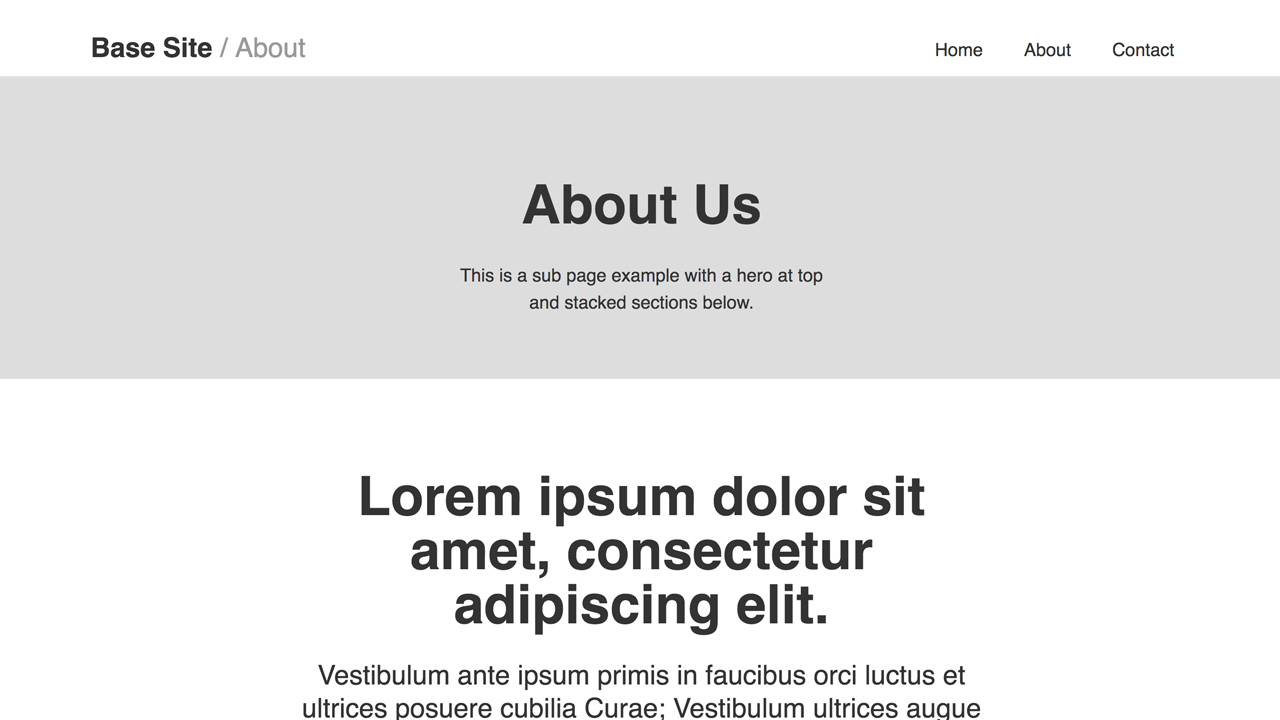
Step 6 Sub Page(s)
Description:
Create sub pages that are well suited for specific content, such as an about or post page with long form content (e.g. articles for reading) or a traditional two-column sub page with a main content area and sidebar with a sub nav. Other sub page examples include a contact page with a simple contact form, a post/product/image listing page, and a product/feature detail page.
-
Update the index.html page site navigation to link to the
following example sub pages;
- about.html, contact.html (optional: products.html, product-detail.html)
- Copy/paste the index.html page and to create each of the above example sub pages
-
Potential new features/components to consider when adding
sub pages and sub page content:
- Articles, forms, inline page anchors, responsive grids for lists and thumbnail images, and popular design patterns and UI components such as modal tabs, overlays, carousels, and accordians/collapsible panels.
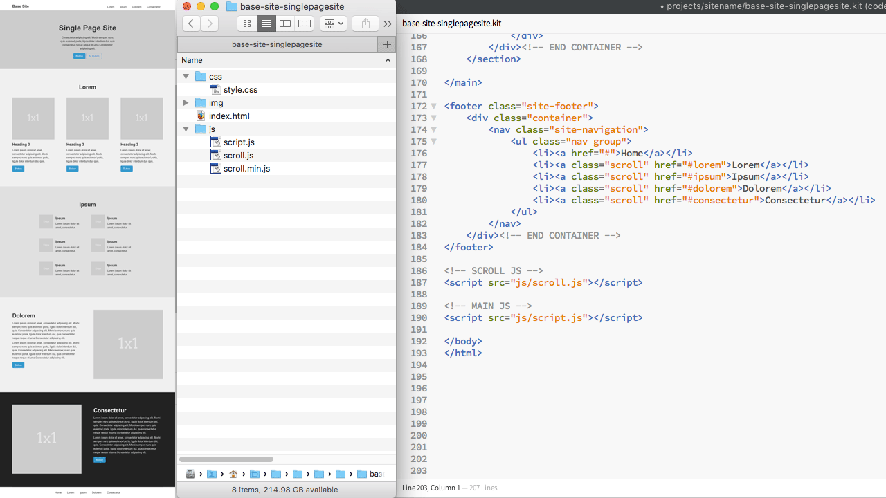
Step 7 Single Page Site
Description:
Create a single page web site with multiple sub sections that can be accessed either via the inline page anchors in the site navigation or by scrolling the long, vertical layout of the page.
- Working with one main index.html file, update the site navigation to link to page anchors (ID's) for each of the main sub sections (e.g. a href="#section1" or href="#about")
- Add ID's to all main sub sections (e.g. section id="section1" or id="about")
- Once the page anchors are tested and working, use javascript to add animation
- add this scroll.js file to your js folder, or use the original anchor-scroll js code from Benjamin De Cock
- add a link to scroll.min.js file at the bottom of your html file
- add a class="scroll" to each link that will utilize scroll.js
Step 8 Create Standalone Repos (Optional)
Now that you have succesfully created both a code base for a multi-page site and a single-page site, consider creating separate re-usable (i.e. easily clone-able) repos for each of them, so can refer to them as "your" (or "my") site bases for personal use in the future.
- Copy your "base-site-subpage" directory and paste it into a new repo named "My SiteBase for Multi-Page Sites" (or something like that). Similar to how to did so for your single page site, change the titles (e.g. Site ID's) for each page to "Site Name" to distiniguish it from your "sub pages" SiteBase steps 6A & 6B. Feel free to adjust the base colors to suit your personal preferences.
- Copy your "site-name-subpage" directory and paste it into a new repo named "My SiteBase for Single-Page Sites" (or something like that). Feel free to adjust the base colors to suit your personal preferences.
Step 9 Custom Site
Override the base styling with site-specific styling and custom HTML, CSS, & JS.
- Add a section entitled "SITE SPECIFIC CSS" to the bottom of your base style.css file and use this area to add any custom site-specific (e.g. project-specific, client-specific, etc) styling. Try not to edit your "BASE CSS" above. Instead, try to override the base styles at the bottom of your style sheet in this designated area that is seperate from your base styles.
-
Style (CSS) changes to consider:
- Customize the typography.
- Use a custom color palette
- Consider adding aesthetic graphical elements such as line, shape, texture, and background photography.
-
Content (HTML) changes to consider:
- Change the header and brand identity of the site (e.g. change the site name, add a logo, add a tagline, etc.).
- Use real content (no placeholder photos or copy).
- Consider using a "content-first" approach to establish a strong content hierarchy, information architecture (IA), and navigation.
- Use your grid (rows and columns) to experiment with different layouts to best present the content.
- Utilize and embrace known good usability practices, UX design patterns, and UI components.
SiteBase Sassy Lessons
The SiteBase Sass variation builds upon the core SiteBase static code by adding support for SASS. Designed for those with a basic understanding of how to build a static site with straight-up HTML, CSS, and JS, looking for an intermediate-level front-end workflow and build environment that is not too complicated or advanced. No command line (CLI) required for version 2.0. Instead, the GUI-based software application Prepros is used to manage all build tasks (e.g. to compile SASS) and for deployment.
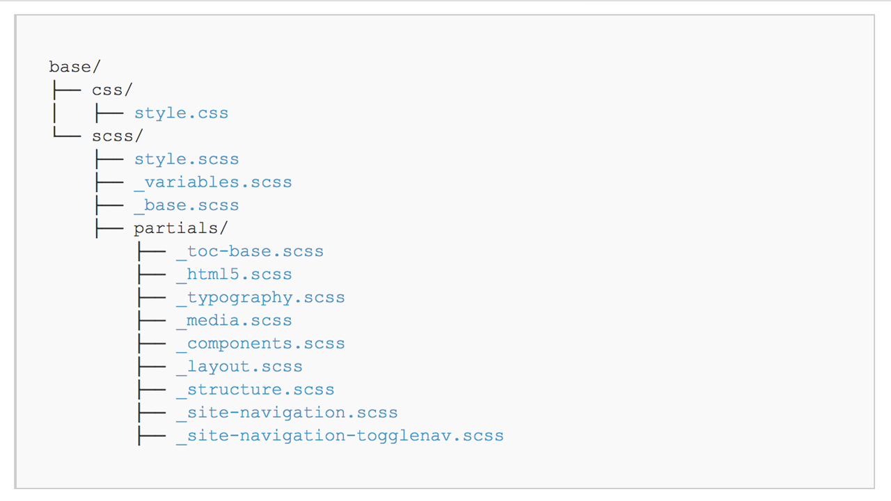
Lesson Modular SASS Partials (via Prepros)
Description:
In this lesson, we will convert SiteBase Static into Sitebase Sassy by working backwards, starting with the static css stylesheet and converting the single-file CSS system into an organized multi-file SASS system.
- Setup a local front-end web development environment to compile SASS. In this step, we will use a Prepros, a GUI-based front-end compiler. In another lesson, we will use Gulp.
- Establish a custom organizational file system using SASS partials that embraces best practices and strategies from popular CSS methodologies (e.g. SMACSS).
- Convert the CSS to SASS by reverse engineering the original, singular CSS file and separating it into a modular system of multiple SASS partial files. The new SCSS files will embrace SASS features to improve the coding experience, such as variables and nesting.
SiteBase Gulp Lessons
SiteBase GUlp builds upon the SiteBase Sass variation by using a command line interface (CLI) workflow to manage all build tools, including NPM, a package manager to setup and install project dependencies, Gulp, a task manager, to handle various build processes such as compiling SASS and optimizing images, and Git (via Github) for version control. Designed for those looking to learn how to set up a more advanced front-end development workflow.
[ Lessons coming soon ]